It’s the color hardest to obtain and most desired of art history. Its price was equal to that of gold and was reserved for sacred objects, such as the mantle of virgins. Now the Prado paints its Central Gallery a deep indigo blue. But what is hidden behind this decision?
At the beginning of October, visitors will be able to enjoy the new chromatic stage of the Central Gallery. Over time, its appearance has varied according to fashion, and these chromatic variations imply slight changes in the perception of the works.
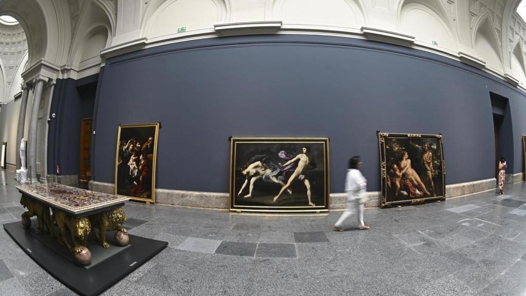
For this they will be painted, according to the Efe agency, 122 meters of gallery that will affect 58 paintings, In addition to the repainting of the walls, a review of the lighting systems and the rearrangement of the exhibited works will be carried out.
Already in 1959, researchers Guilford and Smith demonstrated that color directly affects mood and that brighter and more saturated colors generate a greater sensation of pleasure. Subsequent studies have confirmed that cold colors are, in general, more pleasant and calm than warm ones.
This Central Gallery has gone through different phases: from greenish gray clear from 1927 to crema from the beginning of the century and warm gray from the Titian exhibition in 2003, until the gray green current. Each color has dialogued with the works and with the natural light that bathes the space, giving different personalities and atmospheres to the room.
View of the Central Gallery during the repainting process. Photo: EFE Agency
The blue chosen for this new stage seeks to establish a vibrant contrast and enhance collections of Spanish and Italian painting and radically changes the tradition of light colors or pastel colors. The Gothic painter Cennino Cennini already said it in The art book:“Ultramarine blue is a noble, beautiful color, more perfect than any other color, there are no words to describe it.”
The deep blue acts as neutral and balanced backgroundallowing the warm colors and golds of old paintings to shine more intensely and vibrantly. The color change is a museographic resource that transforms spacegiving it its own identity and underlining the relationship between architecture and pictorial collection.
This blue improves contrast and provides a greater sense of depthmaking figures, details and scenes appear clearer and separated from the wall. Blue enhances the strong chromaticism inherent to the works on display, highlights red, green and gold tonesand contributes to the pieces not being perceived only as isolated objects, but as elements integrated into a sensory-rich environment.
Preliminary tests, such as exposure El Greco. Saint Dominic the Ancient (from February to June 2025), have validated this change – since the color they will use will be the same as that used in this exhibition – and have shown that it helps the works “float” visuallyreceiving positive comments from visitors and specialists.
General view of the repainting process. Photo: EFE Agency
“Let’s not fool ourselves,” said museum director Miguel Falomir, “colors respond to fashions; there was a time when all exhibitions of Venetian painting had to be in a burgundy color. This wall of the central gallery has been painted in a thousand ways.”
He also adds in his statements: “At first the first testimonies we have were of a quite striking green color, which was in tune with a late classical aesthetic, then it was painted white, light gray, Pompeian red. Sometimes tastings are held and half of Pantone appears on the wall. Although “There are certain colors that have been optically proven to work better.”.
In addition to the Central Gallery, the museum currently uses the color blue in the Gothic painting room and in the exhibition dedicated to the Virgin of Guadalupe.
Kandinsky and ‘The Blue Horseman’. Blue in art
The abstract painter Vasili Kandinsky (Moscow, 1866- Neuilly-sur-Seine, France, 1944) formulated a personal color theory through which each chromaticism is associated with a musical sound in a synesthetic process.
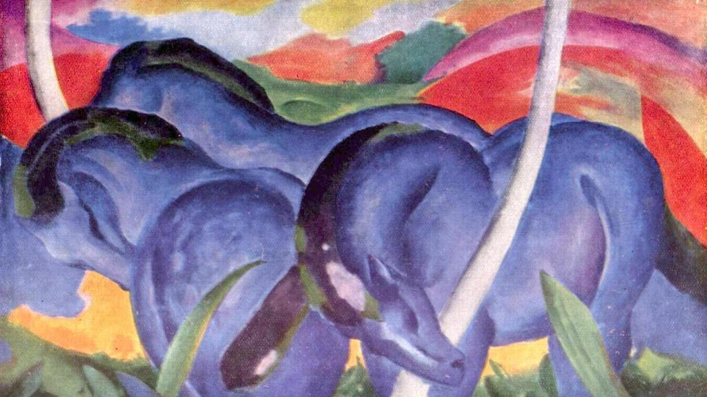
Franz Marc: ‘Blue Horses’, 1911. Photo: Wikipedia
Thus he wrote in Of the spiritual in art in 1911: “the color is the key; the eye is the hammer. The soul is the piano with many strings. The artist is the hand that, by touching this or that key, preordainedly sets the soul into vibration.” Thus, colors produce specific inner resonances, emotions and moods.
Kandinski associated psychological and spiritual characteristics with each color: blue represented spirituality, the deep and the infinite; yellow, the vital and earthly; red, energy and strength, among others. Franz Marc, a fundamental member of the group, assigned similar symbolisms: blue was masculine and spiritualfeminine and cheerful yellow, and violent or earthy red.
Kandinsky and Franz Marc (Munich, 1880 – Braquis, France, 1916) chose this color to identify the Blue Horseman movement (The Blue Rider) because they believed he had a inner resonance capable of elevating the spirit, It represented the search for a new artistic transcendence, moving away from naturalistic representation and approaching universal and emotional values.
Yves Klein registered his own blue
Yves Klein (Nice, 1928 – Paris, 1962) was a revolutionary French artist of the 20th century, famous for founding the movement New Realism and for its radical exploration of color and space. He created the International Klein Blue (IKB), a deep and luminous blue, which became the focus of his work during his so-called “blue period”. Furthermore, he developed the famous Anthropometrieswhere models covered in this pigment captured their bodies on the canvas like living brushes.
In addition to these artists, many others have used blue in various periodslike Picasso’s blue period, from 1901 to 1904, in which he became the absolute protagonist and Katsushika Hokusai with The great wave (1831) was the banner of the “blue revolution”.
This revolution begins with lirruption into the Japanese market Prussian bluea European synthetic pigment, more intense and much more resistant to light than traditional vegetable blues. Hokusai was one of its decisive introducers of ukiyo-e that used Prussian blue for the first time (new and more resistant than vegetable blues).
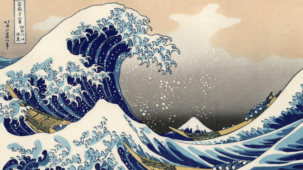
Hokusai: ‘The Great Wave off Kanagawa’, 1831. Photo: Metropolitan New York
Henri Matisse was another of his standard bearers with his “blue nudes”, Blue nudes (1952): gouaches that culminate in the Not blue where blue is form, background and body or James Turrell, in his works Ganzfelds y Skyspaces: architectures of light that often immerse the viewer in total blue fields.
The post Why does the Prado paint its walls blue? What is hidden behind this decision appeared first on Veritas News.